This doesn't mean RSI (or other TA indicators) is useless. But the difference between a derivative of price and actual trade data is substantial. TA indicators need to be reinforced with volume data.
What You Were Told vs. What the Data Shows
Beginner6 min read
Trading is full of ideas that sound convincing — until you start checking. Let's check.
"Institutions Hunt Your Stops"
One of the most persistent ideas: Smart Money can see where your stop-losses are and deliberately move the market to collect them. You're the target. They're the hunters. Dramatic. But let's do the math.
ES trades 1.5-2 million contracts daily. A retail trader with a 5-contract position is 0.0003% of the daily volume. To "collect his stop," you'd need to move the market several ticks. The cost of that move — thousands of contracts. For five? The math doesn't work. It's like turning an ocean tanker around to dodge a fishing boat.
What actually happens: stops cluster at obvious levels. Below double bottoms, behind round numbers, below the Low of Day. This is no secret — anyone can see it. Large participants know that BEHIND these stops lies liquidity. When the stops trigger, they'll turn into market orders. The large player places a limit order on the other side and accumulates a position FROM this wave of market orders.
Nobody is "hunting" the retail trader. Large capital uses the predictable behavior of the crowd as liquidity for entry. Not "against you." Past you.
And you know what? That's actually good news. Because if you understand the mechanics — you can position yourself on the same side as large capital. But more on that in the trading models module.
"The Pattern Worked Last Time — So It Works"
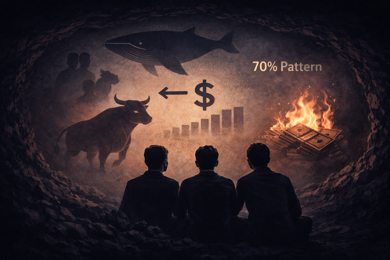
Head and shoulders, double bottom, flag — every textbook promises a win rate. 65%, 70%, even 80%. But ask yourself: 70% is the average across the board. But YOUR specific pattern, right now, on this chart — is it in the 70% that will work, or in the 30% that won't?
TA doesn't answer that question. The shape is the same. What's inside is unknown.
Order flow answers it. A double bottom with absorption at the level (a large player standing firm and not letting price go lower) — one story. A double bottom with nothing behind it (price happened to reach the level twice and retraced on fading momentum) — another story. Same shape. Different substance. And it's the substance that determines which group your trade falls into.
"RSI Is Oversold — Reversal Incoming"
RSI below 30 — oversold, going up soon. RSI divergence — a "confirmed" reversal signal. Sound familiar? Of course. It's one of the first indicators every trader learns.
But here's what RSI actually does: it takes closing prices and calculates the average rate of change. That's it. Who was buying, who was selling, whether there was aggression or inertia — RSI has no idea. It reflects what's already visible on the chart, with a lag of several bars. The indicator said "reversal." The market wasn't informed.
"There Must Be One Perfect Indicator"
The search for the Holy Grail — a phase every trader goes through. First RSI. Then MACD. Then Bollinger Bands. Then Ichimoku. Then someone shows you a footprint — and you think: this is it. One tool that shows everything.
It won't. Footprint without profile context is a set of numbers. Profile without footprint is a static map of yesterday. CVD without anchoring to specific candles is a curve you can spin any way you like. Each tool alone is half the picture.
There is no Holy Grail. But there's something better — the ability to read the market and make decisions based on data, not indicator formulas. That's what the rest of this course is about. And we'll start with a simple question: on which markets is this data actually available?
Quiz
1. RSI shows oversold. Why isn't this alone sufficient for a long entry?
2. "Institutions deliberately hunt retail traders' stops." True?
3. Is it possible to find one indicator that shows the complete market picture?
AI Assistant
What You Were Told vs. What the Data Shows
How can I help?
Ask anything about this lesson